This blog explains how we configured and use Grafana to graph and visualize PDU data stored in InfluxDB.
Background
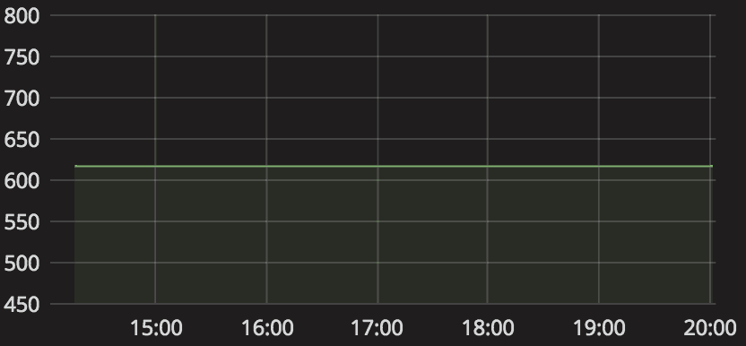
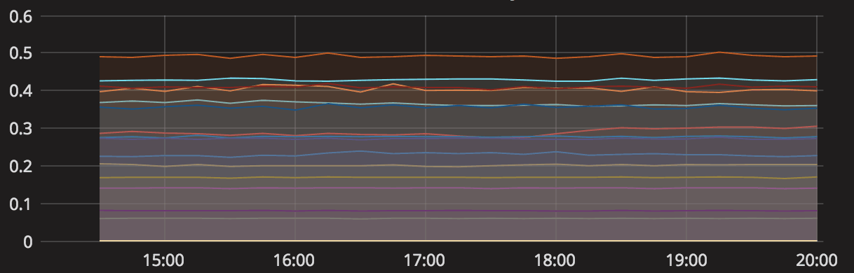
InfluxDB is a time series database that we use to store dozens of metrics from all of our power distribution units (PDUs). This database is updated periodically with a python script that parses snmp data from our PDUs and stores it in the correct table and row. After getting the data into the db, we used Grafana to create graphs of some of the power consumption metrics so that we could easily see how much power was being used by each PDU. All pictures are from Grafana version 4.6.1.
Configure Grafana to Use InfluxDB
After setting up our InfluxDB database and providing it with some metrics from our PDUs, all we had to do was configure Grafana to use our database and write queries to visualize the data. In order to do that, we logged into the Grafana server on port 3000 navigated to Configuraion -> Data Sources and clicked on “Add data source”. InfluxDB is a built-in option to choose from, so we just had to provide a server and database name and credentials to connect to it. Once the data sources were added, we wrote queries to create graphs from them.
Create Graphs of The Data
The picture below shows how Grafana uses InfluxDB’s SQL-like query language to create lines in a graph.

- Log into the Grafana server via web browser on port 3000
- Click on the graph button to create a new row
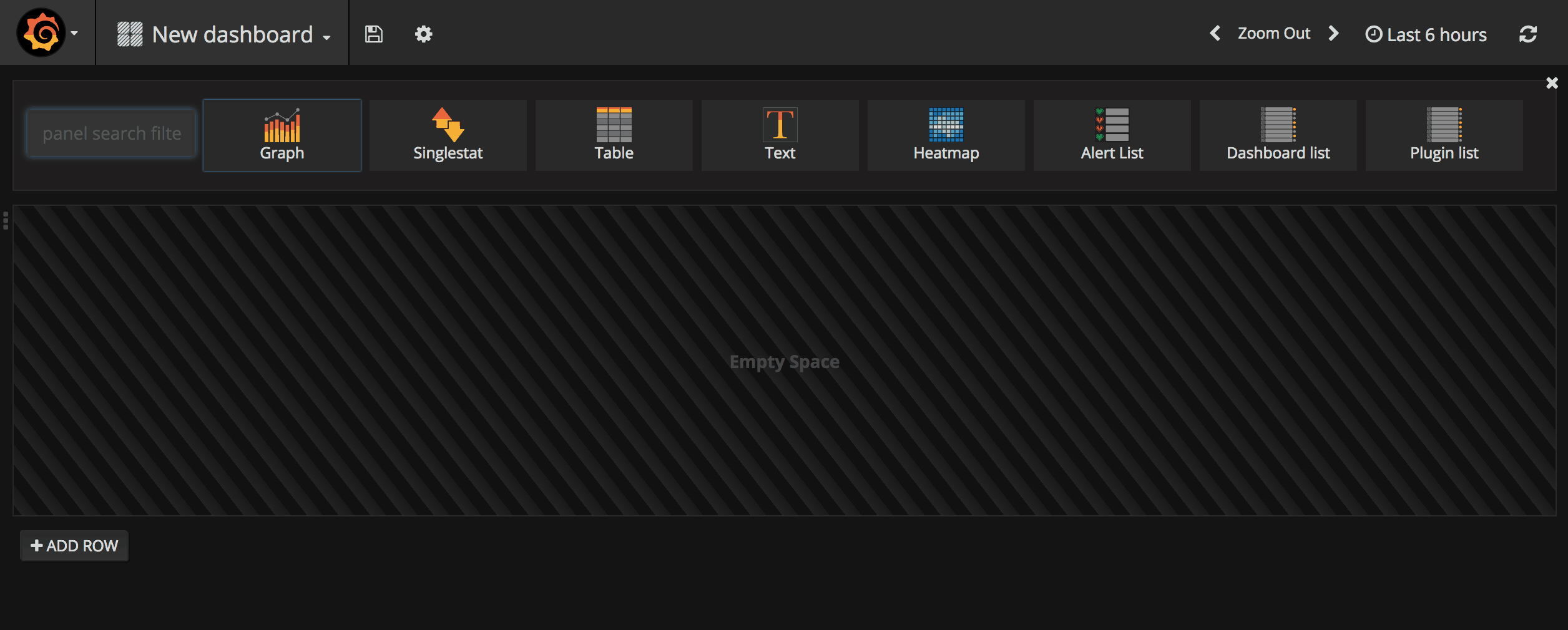
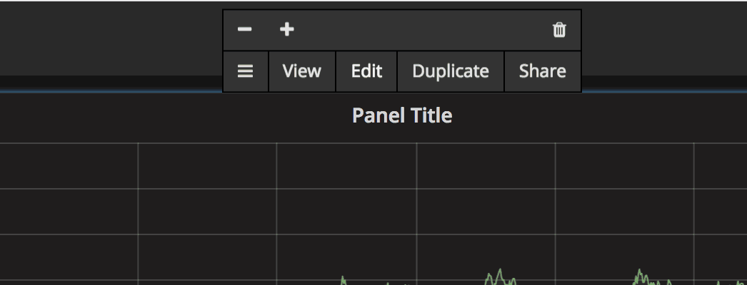
- Click on the new row and click “Edit” in the small box that pops up.
- Click the drop-down next to “Data Source” and select the datasource that we added in the last section.
- Edit this query information and tell it which tables and data to graph from your database.
- Add one or more queries to the graph to compare your data.